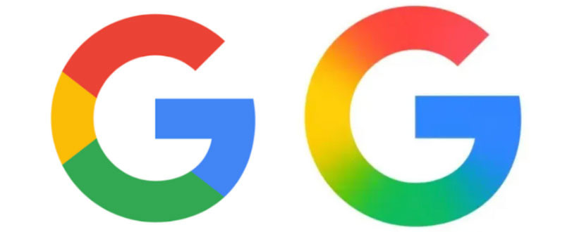
Google has decided to renew its visual identity, turning the user experience into an aesthetic and functional holistic. After a long hiatus, the company updated its logo, seeing this change not only as a visual update but also as a reflection of a vision aligned with the new AI-focused era.

The new design, first tested on Android and iOS in May, will soon be adopted across all Google services. It is expected that this new visual language will be introduced in popular applications like Gmail, Drive, Meet, and Calendar. The iconic “G” letter, recognized by red, blue, green, and yellow colors on the left side of the old logo, now features brighter shades and gradient transitions for a modern appearance. This change is emphasized to be implemented within an integrated framework compatible with Google’s Gemini brand artificial intelligence products.

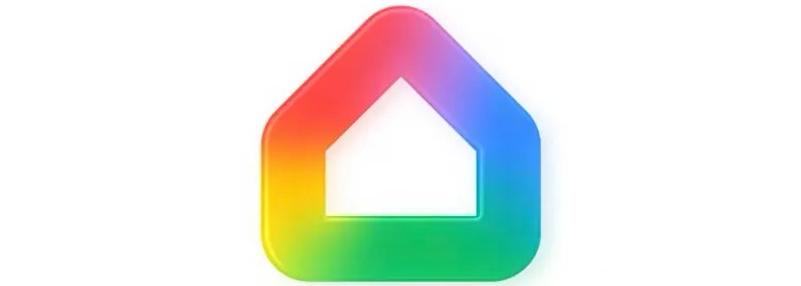
The company describes this step as an “evolution in the age of artificial intelligence” and considers it a symbol of a broad transformation, not just a mere logo change. The new Google Home logo has also been updated to match this style, and this design approach aims to offer users a smarter and more aesthetically rich digital world.
It appears that the changes are currently being implemented quietly, but in the coming weeks, these designs are expected to reach a wider audience. Google maintains its commitment to its heritage while clearly outlining its steps toward the future, aiming to offer users a more integrated and aesthetically enhanced digital experience.


